The "What Are You Working On?" Thread
- Thread starter garyjpaterson
- Start date

")


Latest News
-
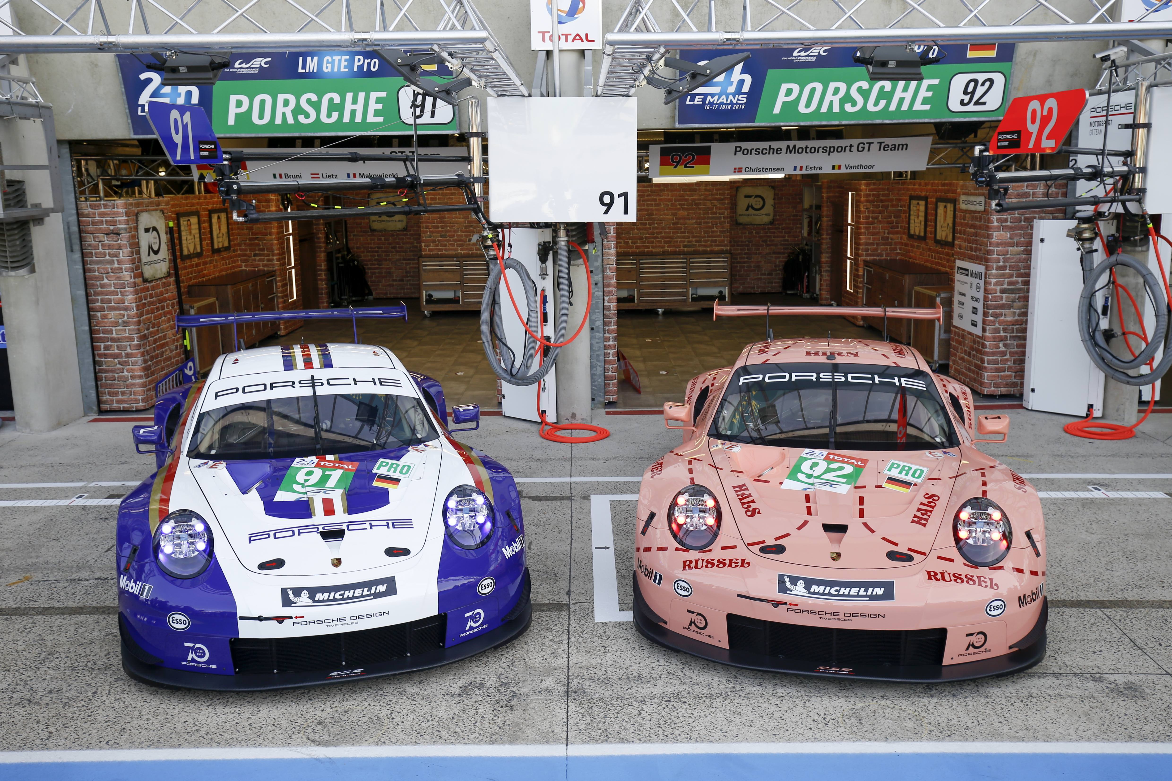
 Le Mans Ultimate Update Includes BMW Art Car LiveryThe June update for Le Mans Ultimate adds a few new features, but also content - including a...
- Yannik Haustein
- Updated:
- 2 min read
-
 2024 Formula One Canadian Grand PrixMontréal is the location for round 9 of the 2024 Formula One World Championship. The Circuit...
- Connor Minniss
- Updated:
- 4 min read
-
Racing Club Schedule: June 9 - 16 - Le Mans Special WeekThe 2024 Le Mans 24 Hours are fast approaching, and that is very much apparent in our Racing...
- Yannik Haustein
- Updated:
- 3 min read
-
"A system for more realism, precision, fidelity and ease of use": Interview With Marble LabsMarble Labs are newcomers in the sim racing space, but the Las Vegas-based company has big...
- Yannik Haustein
- Updated:
- 5 min read
-
![Luca [OT]](/data/avatars/s/3235/3235113.jpg?1697196734) Ride A Rollercoaster In Assetto CorsaSome racetracks with plenty of elevation change are described as rollercoasters, but how about...
Ride A Rollercoaster In Assetto CorsaSome racetracks with plenty of elevation change are described as rollercoasters, but how about...- Luca (OverTake)
- Updated:
- 2 min read
-
Test Drive Unlimited Solar Crown Demo Available On SteamAfter its release date being announced recently, Test Drive Unlimited Solar Crown is now...
- Yannik Haustein
- Updated:
- 2 min read
-
Monster Jam Showdown: "Freestyle" Trailer Shows More GameplayAnother week, another teaser trailer for Monster Jam Showdown. This time, it is all about...
- Connor Minniss
- Updated:
- 2 min read